Dashboards to guide the next stage of the pandemic


Connecting state and local government leaders
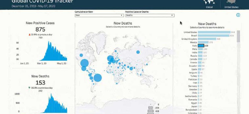
Tableau’s Global Tracker pulls COVID-related information from multiple data sources into one visualization so users can see and interact with fresh data to inform public policy and business decisions.
Now that vaccine distribution is picking up, a new Covid-19 global tracking tool aims to give government agencies an easy way to compare pandemic-related data as they work on a return to normalcy.
The Global Tracker, announced today, is embedded into the Tableau COVID-19 Data Hub, which launched in March 2020. It combines and visualizes key metrics on localized disease spread, testing and vaccination and social policy indicators, from both U.S. and global perspectives to help agencies understand their communities in the context of others.
The tracker offers two dashboards: one of the United States and one of the world. Domestically, each state has a color-coded square that indicates the number of positive cases. At the bottom of the page are six graphs showing statistics, such as the number of cases, deaths and testing. Hovering over a state’s square brings up key data points such as new cases per 100,000 residents. Clicking on it, filters the graphs to show more data points for just that state. Users may also adjust the view to the county level.
“Only when we look at all of those metrics in one cohesive view can we see how each element relates to the other,” Jeremy Blaney, director of global COVID-19 data hub and project manager at Tableau, said during a presentation of the new application. “Our new Global Tracker pulls in a lot of information from a lot of data sources into one visualization updated daily, allowing people to see and interact with those data points.”
The global dashboard acts similarly to the U.S. one, with color-coded squares on the countries indicating their current case status. From there, users can drill down by zooming in on a specific country. One that stands out right now is Israel, which has a dark blue dot because it has delivered 91.57 vaccinations per 100 residents. A graph at the bottom titled “Oxford Stringency Index” uses data from Oxford University to determine policy shifts in COVID response. With the dashboard, users can see that a relaxation in policies at the end of last summer coincided with an increase in cases and deaths in early fall.
Users can also adjust the time frames for the data from as little as three days to five years.
The graphs show cases, deaths, positivity rate, vaccine rollout, vaccine coverage, tests, testing eligibility, contact tracing and the Oxford Index. Data comes from multiple sources that the data hub pulls from, including HealthData.gov, Johns Hopkins University and the New York Times.
The toughest part was making all the data usable, Blaney said. It had to be standardized to be stitched together; reporting dates might be spread across hundreds of fields, for example. Additionally, although each country is assigned a country code to facilitate data sharing, “sometimes there’s some inaccuracies in them or misspellings,” he said.
To make the data functional, Tableau worked with MuleSoft and Salesforce to create a tightly controlled pipeline to ingest, standardize, clean and structure all of the underlying datasets, Blaney said. “The pipeline is triggered at predefined intervals throughout the day,” he said. “A Tableau visualization sits on top of this for quality control purposes. It highlights irregularities in the data pipeline and notifies process leaders so they can take corrective action.”
Tableau Prep Builder and Tableau Prep Conductor are also part of the pipeline. The former standardizes, cleans and structures inbound datasets, and the latter automates the processes.
In some cases, “different field names are being used to describe the exact same thing,” Blaney said. “We are mapping those fields to a canonical data model that we developed. In other words, we’re giving them a common language so that way, they can easily be used in combination with one another -- critical to allow us to visualize it.”
The tracker and data hub are both available for use by businesses, governments and the public for free. Tableau also offers Starter Workbooks that anyone can use to combine their internal data with Tableau’s.
This article was changed March 4 to correct the name of the Tableau Prep Builder product.
NEXT STORY: Getting health data in shape