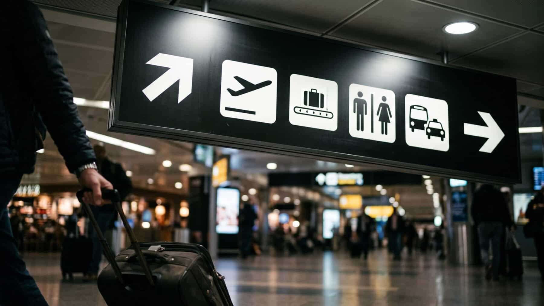
Every traveler who has sprinted through a hub knows the feeling: you scan the sign, register nothing, and scan it again.
A gate number, a terminal letter, a walking time, a baggage-claim arrow. Four pieces of information, all on one board bolted to a ceiling thirty feet up. What almost nobody realizes is that the sign itself is doing something measurable to your brain.
A recent eye-tracking study has now put precise numbers to the damage.
Most passengers blame the airport. The research suggests they should also blame the design.
So what, exactly, is the sign doing wrong?
Why the brain stalls when a sign is packed with words
The core problem is a working memory bottleneck. When a passenger reads an airport sign, the visual cortex must pull each word off the board, hand it to the language-processing system, decode meaning, compare it to a destination held in mind, and then decide whether to turn left or keep walking. That chain works smoothly with two or three pieces of information.
Pack in more, and the processing queue backs up. Text-only formats increase cognitive load and reduce decision confidence, while text-plus-graphic formats improve performance by lowering visual effort.
The icon acts as a pre-linguistic shortcut: the brain classifies a baggage-belt symbol or a gate arrow in roughly the same instant it registers the shape, shaving off the decoding step entirely. So the sign with a small pictogram beside the words is not prettier. It is mechanically faster for a human brain to process.
What the scene looks like for the hundreds of millions of passengers moving through US airports
Air travel is a dominant mode of transportation, with surveys consistently finding that a majority of Americans plan to fly in any given year. That is a vast daily audience passing beneath overhead boards that, in many older terminals, were designed decades before eye-tracking existed as a research tool.
Many existing signage designs lack user-centered optimization, leading to inefficient navigation and decision errors. Inefficient navigation is not just frustrating: it adds dwell time at signs, creates pedestrian bottlenecks at junctions, and compounds the anxiety about delays and disruptions that weighs on a significant share of flyers.
The physical architecture of most US hubs magnifies the problem. Terminals have extensive internal spaces and complex layouts, and given the substantial volume of passengers and relatively limited staffing, there is a pronounced dependence on the signage system. A well-designed sign can redirect tens of thousands of passengers without anyone asking for help.
The eye-tracking evidence and where it comes from
The study used a two-phase approach: causal machine learning identified key design factors from real-world airport signage, followed by a laboratory eye-tracking experiment with 60 participants. Researchers applied a three-level information-density manipulation, low, medium, or high, combined with text-only versus text-plus-graphic formats, while measuring gaze behavior, accuracy, and subjective ratings during visual search tasks.
The researchers found that icon-text combinations showed the strongest performance gains precisely under conditions of high time pressure, when passengers are most pressed for a decision.
The time-pressure finding is the most practically useful. Running for a connection, hauling a carry-on, glancing up for two seconds before deciding left or right: those are the moments where icon-plus-text formats improved performance most sharply.
A parallel study of metro station signage adds a complementary layer, identifying both a three-anchor mechanism of signage types and a distinct cognitive hierarchy that eye-tracking confirms: travelers reach for color first to localize, then confirm with a number, then read the words. Text-only signs collapse that hierarchy into a single slow channel.
Where the system still fails and why airports are slow to fix it
The research has clear limits. The laboratory setting of 60 participants is a controlled environment, not a heaving holiday terminal with screaming children and gate-change announcements competing for attention. Real airports add noise, crowd density, and the specific emotional weight of almost missing a flight. The airport study’s participants were also required to be Chinese-speaking, so its findings may not translate directly to every international terminal context.
Retrofit costs are a genuine obstacle. Replacing every static sign in a major hub requires new manufacturing, new mounting hardware, regulatory approval, and in many cases fresh architectural drawings. That is a multi-million-dollar project spread across terminals that never pause, and as travel costs squeeze flyers, airports are not eager to close concourses for upgrades passengers cannot see on a price comparison site.
Even digital boards, which can cycle through icon-text combinations dynamically, are often programmed by operations teams rather than cognitive designers. The hardware is capable. The software defaults to whatever the gate-management system pushes, which is typically plain text.
What cleaner sign design could realistically deliver
The practical upside is straightforward. A sign that takes one fewer second to parse across millions of gate-change moments a year is a compounding operational gain: fewer missed turns, fewer frantic questions at staffed desks, fewer passengers boarding the wrong shuttle.
Terminal maps should align with a passenger’s physical orientation rather than defaulting to a north-up format. Clear landmark references and simplified layouts reduce cognitive load. Orientation before information is the governing principle, and it is not being applied consistently anywhere in the US network.
The same logic applies to every directional sign above a terminal walkway, not just printed maps.
For travelers right now, knowing the mechanism offers one small practical edge: look for the icon first, not the words. If the board has one, your brain will confirm direction faster. If it does not, slow down for a beat rather than acting on a half-processed glance, especially if you are already factoring in how a stressful transit leg compounds daily mental load before you even reach the gate.
