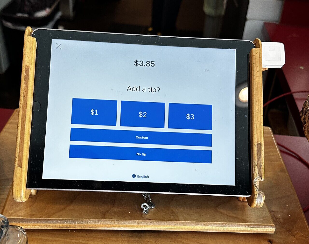
A barista spins the tablet around before the coffee even hits the counter.
Three buttons glow on the screen, each one bigger than the last.
A thumb hovers for a second too long.
Behind that pause sits a quiet experiment running on millions of Americans every single day.
Economists have now traced exactly what happens when the numbers on that screen change.
Why the buttons themselves decide what you pay
The mechanism is almost embarrassingly simple: whatever numbers appear first on the screen become the mental ruler a customer uses to judge what counts as generous. Behavioral economists call this anchoring behavior, and it means a button reading 25 percent does not just offer an option, it redefines what feels normal before a customer has consciously decided anything.
So when a till shows 15, 20 and 25 percent, the middle option quietly becomes the social default choice, the one most people tap without doing any math. Swap that same screen to 20, 25 and 30 percent, and the middle shifts upward with it.
Nobody wants to look cheap in front of a worker standing right there. Choosing the lowest number on a lit up screen can feel like a small public statement, so customers gravitate toward the middle, and higher preset menus simply move where that middle sits.
Yet the same screen that nudges people toward generosity also creates an easy exit. A custom box takes typing and a few extra seconds, while hitting no tip or walking past the prompt takes almost none of that effort at all.
Picture the counter where this plays out every day
Walk into almost any coffee shop, food truck or fast casual counter in the country and the same small screen is waiting. It used to be a jar with a few coins in it; now it is a digital payment terminal timed to appear the instant a card gets tapped, before the drink is even made.
Because the interaction is so fast, there is barely room to think. A cashier is watching, a line is forming, and the screen gives three seconds to decide what used to take a private moment of consideration.
None of this is accidental. Point of sale companies design these prompts deliberately, choosing the order of numbers, the size of the buttons and whether a zero tip option is even visible, because small interface choices measurably shift what people pay.
That same pressure now bleeds into online checkouts too, where surveys show most Americans already feel they cut spending wherever they can, making a surprise tip prompt land even harder on a tight budget.
The evidence behind the numbers, straight from the data
The clearest proof comes from a landmark study of New York City taxis. Economists analyzed more than 13 million credit card rides processed through two different in cab payment systems that happened to show different default tip menus to otherwise similar riders.
One system offered 15, 20 and 25 percent buttons in every ride. The other asked riders for a flat $2, $3 or $4 on cheaper trips and jumped to 20, 25 and 30 percent on longer ones, creating a natural test of what happens when the same rider sees a different set of numbers.
Riders shown the higher menu tipped noticeably more on average, with the researchers measuring an increase in tip amounts of approximately $0.27, $0.30, which is more than a 10 percent increase in the average tip at that margin .
Here is the catch almost nobody expects: those same higher menus also pushed a much larger share of riders to leave nothing whatsoever. The same researchers found that rides with the higher tip suggestions are over 50 percent more likely to receive a zero-valued tip than those with the lower suggestions , meaning the aggressive defaults that lifted the average also emptied out the bottom of the distribution.
Where the trick runs out of road
Even so, the effect is not limitless. Once a suggested percentage crosses a certain threshold, customers do not simply comply, many feel manipulated and either tap custom, skip the screen, or quietly resent the business behind it.
That resentment shows up in newer research too. A separate study of consumer responses to tip defaults, described as more tips, fewer customers, confirms that prior research finds that higher default levels increase tip amounts, but this paper reveals that higher defaults have the opposite effect on consumers’ non-tip responses, decreasing things like repatronage . Separate consumer surveys have found that roughly half of shoppers say a tip screen has made them feel pressured rather than appreciated, which suggests the anchoring effect has a ceiling where backlash takes over from compliance.
Context matters just as much, since a sit down restaurant with a server returning repeatedly to a table behaves differently from a counter where a worker hands over a drink and never sees the receipt. Worse for workers relying on the system, this same body of research suggests the zero tip backlash and the drop in repeat visits can erase some of the gains from higher defaults, meaning the screen can raise the ceiling and lower the floor at the same time.
What it means for the next time the screen turns around
None of this makes tipping screens a scam, but it does mean the three numbers glowing on that tablet were chosen on purpose, tested against real transaction data, and tuned to nudge behavior rather than simply record a generous impulse. Recognizing that is not cynicism, it is just reading the room correctly.
That awareness matters more as these prompts spread beyond coffee counters into self checkout lanes, parking apps and delivery platforms where a server is not even present. The same habit of forming spending defaults that works in a cab now shapes decisions far outside the restaurant industry.
Some businesses are already testing gentler menus and visible no tip buttons, a small concession to the backlash that higher presets have started to generate among regular customers.
So the next time that screen spins around, the choice still belongs to the customer standing there, even though the numbers were never neutral to begin with.
