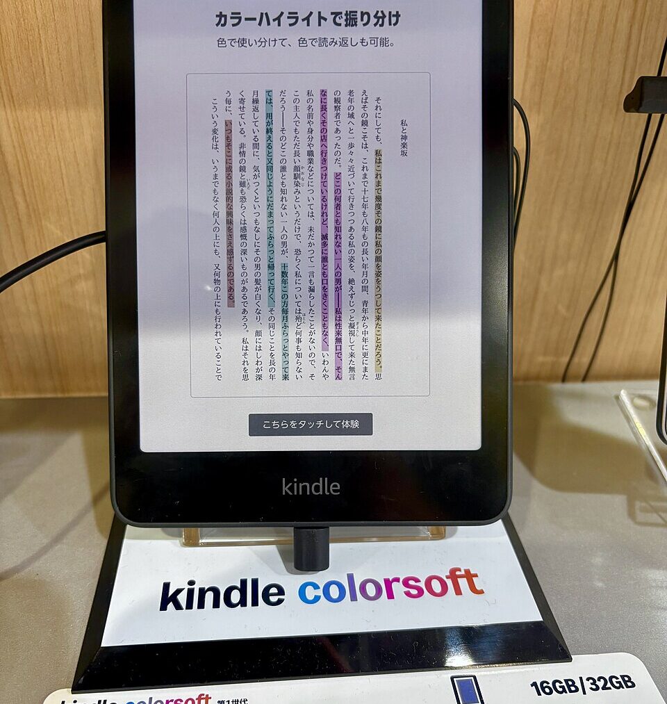
A reading tablet sits on a nightstand, its screen split between a crisp block of black text and a muted book cover just below it.
Zoom in on the text and it looks printed on paper.
Zoom in on the cover art and the edges soften, like a photocopy of a photocopy.
Both images come from the same panel, inches apart, built by the same company.
Nobody tells you why one looks sharper than the other.
So how can one screen show two different sharpnesses at once?
Why the same screen can’t show text and color at equal sharpness
Every pixel on a Kindle Colorsoft does double duty. For plain black and white reading, the display drives tiny ink particles directly, producing a resolution of 300 ppi for black and white content , the same crispness Amazon has used on its monochrome Kindles for years. That is the number on every spec sheet and the reason text looks so clean.
Color works differently. Amazon uses a color filter array near the top of the display stack, just under the glass. The filter groups four physical pixels into one colored dot, the only way to paint red, green or blue onto a surface built to move black and white particles.
So the moment an image needs color, effective resolution falls to roughly 150 pixels per inch. 150 ppi for color content is the trade-off inherent to this approach, and shoppers lose half the resolution to gain color. The ink layer never changes. What changes is how many sharp pixels get grouped and masked behind colored glass to fake a shade the hardware cannot otherwise make.
That tradeoff is a wall every color e-paper maker hits, not a flaw being hidden. Early color filter layers lost too much light, leaving displays dark and low resolution before engineers found workarounds.
Inside the redesigned device built to soften that compromise
The manufacturer’s answer, unveiled this month, is not a new color technology so much as a new box built around the old one. The redesigned family starts with a “reverse stack” construction, which it described as a first for e-readers . Every device now features a flush-front display, giving each one a screen with no raised border and color that wraps seamlessly to the back.
Killing the raised bezel matters more than it sounds. The company said every new device has a flush-front display, meaning the raised border around the screen is gone, and the result is a thinner, more portable device with an uninterrupted reading surface. That narrows the visual gap between the sharp text layer and the softer color layer a fraction of a millimeter above it.
Behind the glass sits hardware most readers will never notice by name.
The new Kindle Colorsoft uses a completely redesigned display with a light guide that incorporates nitride LEDs to enhance color and increase brightness while retaining detail, and an oxide backplane with custom waveforms for fast performance and higher contrast for both color and black-and-white content. None of it changes the math of four pixels becoming one. It just makes the loss less visible, the way a good print shop hides a coarse halftone dot with the right paper.
What the new lineup actually costs and where the gap shows up
The refreshed Colorsoft goes on sale this month at prices spanning a noticeable range. Kindle Colorsoft is available from $289.99 , while the Signature Edition adds aluminum housing, 32 GB of storage, an auto-adjusting front light, double tap to turn pages, and comes in two colors . Both are confirmed to ship on Oct. 28 .
That price gap tracks a gap in materials, not in the display’s physics. Both models run the identical color filter underneath, and according to Amazon’s own newsroom announcement of the redesigned lineup, the resolution ceiling for photos and comics stays the same no matter which one a shopper buys.
Independent coverage reached a similar verdict on color itself. Reviewers note the panel stays sharp for black-and-white text, while color images are softer than they would be on a tablet , even as everything still reads reasonably well on the page.
That restraint looks deliberate. Amazon said it was designed to deliver paper-like color without the glare of a tablet, for reading things like comics, graphic novels and travel guides , a different target than the vivid backlit panels most people carry daily.
Where this approach runs into trouble on real screens
The compromise has not always stayed invisible. The original Colorsoft, Amazon’s first color e-reader, faced early complaints about yellow discoloration bands along the bottom of the display, a defect serious enough to draw outside scrutiny.
One materials expert pointed to the adhesive bonding the filter to the glass as the likely culprit. A supply chain analyst suggested Amazon used a different adhesive layer on the color model than on its monochrome Kindles, one that may degrade faster than usual, which would explain discoloration where it sat thickest.
That history matters for the newest redesign too. The new version is, among other things, an attempt to address the uneven edge tinting that affected some early units of the first version , a patch alongside, rather than a full replacement of, the underlying hardware approach.
It is a reminder that squeezing color out of ink-based glass still involves real layers, glue included. Readers curious how components age under normal use have seen similar surprises with a battery health reading sliding quietly over time.
What this means for anyone deciding whether color is worth the price
None of this makes the Colorsoft a bad reader. For the plain text filling most books, the screen still hits the same sharp standard that has defined Kindles for years, untouched by any of the color engineering layered on top.
Where the tradeoff shows up is narrow: book covers, comics, children’s titles, highlighted notes.
Anyone reading mostly text-only novels will rarely notice. Readers leaning on visual material will see softer edges every time.
Every company racing to put color on reflective e-paper fights the same physics, stacking filters on ink rather than inventing a new pixel. Shoppers comparing devices, the way some now track resale value after a battery swap on other gadgets, should treat resolution as two separate numbers. The redesign does not close that gap, but it dresses the compromise in a flatter shell, and for most readers that will be enough.
